Did it occur to you that many interior designers know what layout or furniture design can hit it on the nail and what elements can mean disaster to the aesthetics of your room? While some may have the innate ability to identify what’s spot on, most rely on some tricks of the trade.
The Golden Ratio, a mathematical principle that has fascinated artists, architects, and designers for centuries, finds its way into the realm of interior design, offering a blueprint for harmony and balance in our living spaces.
This article delves into how applying the Golden Ratio can elevate your home’s aesthetics, ensuring that every piece of furniture and decor contributes to a cohesive and visually pleasing whole.
What Is the Golden Ratio?
A lesson in scale and proportion, the Golden Ratio, has long been studied, starting with Greeks and Romans. Called as such, the Golden Ratio is fascinating because it follows the organic symmetry found in nature. It is believed that a room built using the Golden Proportion enhances liveability and comfort.
In interior design, the golden ratio translates to a 60-30-10 ratio. The major element takes 60% of the room, while the second most important detail takes 30% and the accents 10%.
The Importance of Scale and Proportion in Interior Design
Understanding the role of scale and proportion, guided by the Golden Ratio, is crucial in interior design. It ensures that the relationship between different items in a room, from furniture to accessories, creates a unified look that’s both comfortable and appealing. This concept helps interior designers use space effectively, making rooms more functional and aesthetically pleasing.
Golden Ratio for Furniture Selection
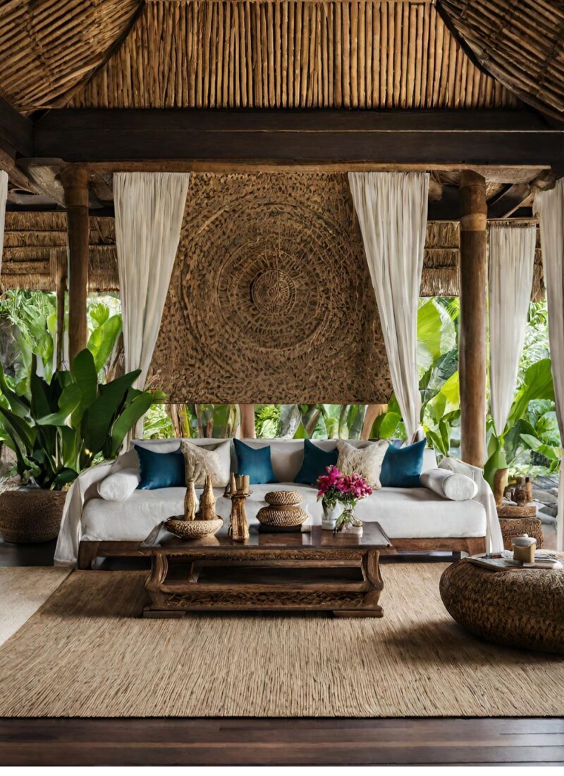
When selecting furniture, the Golden Ratio can help you choose pieces that complement the size of your room and other items. A sofa might be two-thirds the length of a wall, while a coffee table could be one-third the length of the sofa, maintaining harmony and proportion in the arrangement.
Designing with the Golden Ratio: Color and Texture
The Golden Ratio can also inform your choice of colors and textures, creating a layered interior that’s cohesive and visually interesting. Using it to balance bold and neutral tones, or to decide the proportion of various textures, can add depth and contrast to your space in a harmonious way.
The Golden Ratio in Lighting Design
Lighting design benefits from the Golden Ratio by ensuring that light sources are distributed in a way that complements the room’s dimensions and layout. This can involve the placement of lamps, ceiling lights, and natural light sources, contributing to a well-lit, balanced space.
Ways to Apply the Golden Ratio
There are so many ways to apply the Golden Ratio in interior design. You’d often find these in color combinations, furniture placements, patterns, and room layouts, among others.
The Golden Ratio and the Color Palette
Three is the magic number. Your dominant color should take up 60% of the room. For a safe bet, choose neutral. Your dominant color acts as the backdrop to which the other two adheres. If you want to be playful, you can choose brighter colors but put the other two shades in neutral.
Where You Can Use the Dominant Color
- Walls
- Floors
- Carpet
- Flooring
- Large-scale furniture
Your 30% should be used to liven the room. You can use pseudo-neutrals as your second dominant color. Don’t limit yourself to the wall color.
Where You Can Use the Second Dominant Color
- Chairs
- Carpets
- Curtains
- Lighting
Here’s a Tip: Vary the color from your dominant color to make the room more interesting.
Examples of pseudo-neutrals
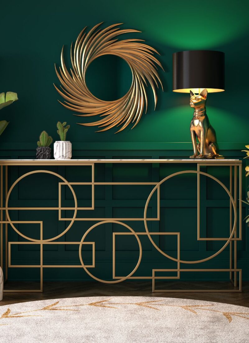
- Forest green
- Pale yellow
- Navy Blue
If your main color is neutral, you can use the brightest complementary color as your 10% of the workable space. This is your pop-up color. What makes this cost-effective is you can always change the mood of the room by changing the curtain color.
Humans as we are, we can overdo decorating too. If it feels off, chances are, you might be overthinking your design and needs to remove a thing or two to maintain cohesion.
Where You Can Use the Accent Color
- Pillows
- Books
- Vases
- Artworks
- Floral Arrangements
- Any small item in the room
Source: https://stringfixer.com/files/31462175.jpg
Take a look at the office space above. White is the perfect backdrop, so the blue pops out. This office space has a wooden feature wall as its secondary color.
On Choosing Color Palettes
Assess your space first before decorating your room and applying the 60-30-10 ratio. Next, think about the feelings you want to imbue with the room. For example, do you want to feel relaxed? Become more creative?
Also, look at your view. If you have a stunning view of the ocean, you don’t want to be distracted by the bright colors of the room; the latter should complement that view. As mentioned in the earlier parts of this article, for the accent color, make sure that you choose the ones that can be easily replaceable.
There are four ways to choose your color scheme based on the Golden Ratio.
- Monochromatic
This palette works best to incorporate a stunning view with your room. To make this work, choose the one color as your dominant color, and the two others can have darker and lighter variations. Subdued colors such as gray, beige, and cream work best for a monochromatic palette.
- Analogous
This palette uses three colors that are adjacent to each other. Often, the main color would be in the middle; the secondary and accent colors are on each side of the main color. For example, you have green as the main color. The secondary could be blue-green and the accent yellow-green.
- Complementary
The complementary palette involves colors opposite of each other on the color wheel. Say, Violet-red and yellow-green. You are dealing with warm and cool colors. In this case, you won’t be using three colors. Rather, the basic 60-40 ratio is the most suitable.
Relatively, you often get a high-energy vibe when using the complementary palette. To stick to the 60-30-10 ratio, add sparingly. Use these colors as your accent and secondary colors. Neutral hues should be your primary color.
- Split Complementary
Split complementary palettes use one more color, often adjacent to the secondary color. For example, if your central color is yellow, your secondary is violet, your tertiary is blue.
Color Generators
Sometimes you need a little help to decide which color combination to use.
The Golden Ratio and Furniture Pieces
Proportions play a big role in furniture placements. So how can you use the Golden Ratio to create a tasteful living room design?
In its basic interpretation, the Golden Ratio is viewed as 2:3. That means the space is divided into two parts, one occupying two-thirds of the space. Concerning this, your bulkier furniture should occupy two-thirds of the room. The second major piece should also be two-thirds the size compared to the bigger furniture.
For example, your sleigh bed should occupy two-thirds of the bedroom. Your horizontal drawers should be two-thirds the size of your bed, and so on for smaller bedroom furniture. Anything larger or smaller means disproportion.
Also, note that larger accents such as rugs should be 40% more than the area occupied by the couch. Similarly, smaller pieces such as a lamp on the table shouldn’t take up more than 40% of the table on which it is sitting.
The Golden Ratio and Room Layout
How will you know that you are overindulging or under indulging with furniture? Measure the floor area and compare that to the area occupied by the furniture. If the area of the latter is more than 60% of the floor area, then you have too much furniture. If the result is much lower than 40%, you tread towards the Minimalist design.
The Golden Ratio and Decor
If you want to add statement artwork to your wall, make sure to cover 60% of the wall. The height of your paintings matter also.
To achieve proportion, hang the painting near the furniture. It should be 40% above the floor and 60% below the ceiling.
Here’s How You Can Apply the Golden Ratio per Room
The Living Room
You’d always find statement pieces and artwork in the living room. Furniture pieces such as sofas, coffee tables, and accent chairs are present in this room too. You can apply the Golden Ratio in this room by picking the right furniture size and the right artwork dimensions.
The Dining Room
The dining room often has subdued lighting, giving a warm aura to the room. Usually, you find signature lighting here. To proportionally install the chandelier, make sure that it is a third of the width of the dining table. However, if you want a bigger chandelier, make sure that the former should be two-thirds the table’s width. Pendant chandeliers should be in groups of three’s, too.
Spinoffs of the Golden Ratio
Who said you can’t experiment with the Golden Ratio? Of course, by now, you’d know that this design principle either has two or three color combinations. But there are a few deviations to the Golden Ratio number.
Instead of having one accent color, you can have two, making the ratio 60:30:5:5. You can also increase your main color or element to 75%, reducing your secondary element to 15% and accents to 10%.
You can even do away with the main and secondary colors. Instead of the 60:40 or 60:30:10 ratios, you can have 30-30-30-10. This is the 110% Rule. You have three equal colors with one accent.
Golden Ratio in Small Spaces: Maximizing Your Area
Small spaces benefit greatly from the Golden Ratio by making them appear larger and more organized. Strategic placement of furniture and the use of proportion can make compact rooms feel more spacious and inviting.
To End
There you have it! We gave you tips on properly using proportion and balance using the Golden Ratio. Do you need help with your interior design? Contact us now!
—-


